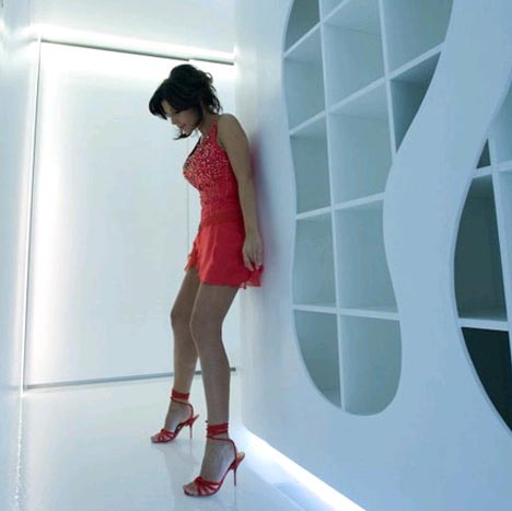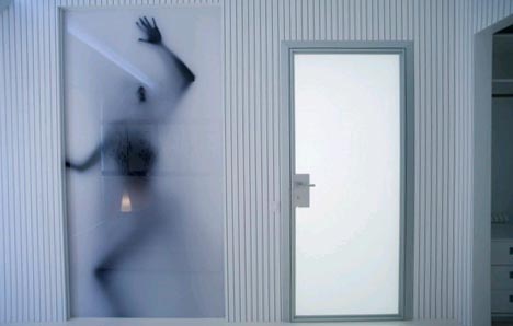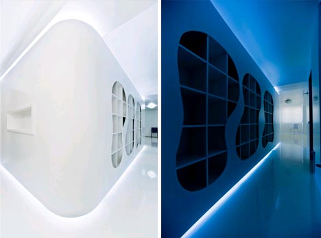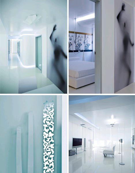

The architects of A.A. Studio were able to visit before construction of the interior room partitions were finished. They were inspired by the small space despite (or perhaps because) of its limited layout, the unusual sizes of structural beams and uncomfortably low ceilings – the architectural results of their inspection were (as these photos show) surprising, strange, sublime and surreal.

Instead of reacting against these spatial limitations, they played with exaggerating and transforming them using subtle lighting strategies but also cheap-but-effective construction tricks – like a plywood panel cut-out over the hallway bookcases.

Except for the splashes of patterned light and ominous colors that emerge from some of the lamps, there is very little in the living room area of this apartment by way of decor. A small Pop Art panel above the bed and colorfully faced cabinets give the bedroom and bathroom, respectively, a sense of being something else while still fitting them somehow within the overall visual themes of the entire set of rooms.
