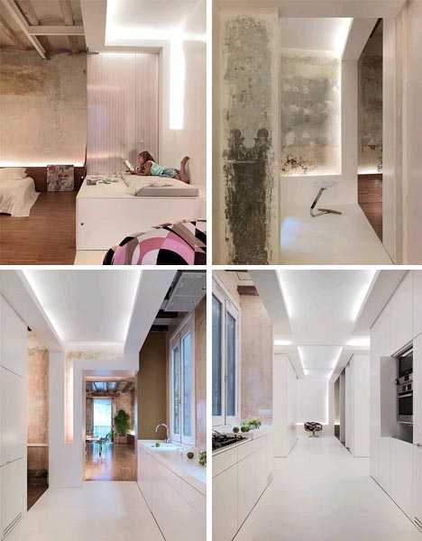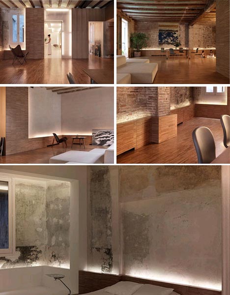
In this redesign, old is clearly different from new and yet there is a complex and lively interaction between the added white partitions,wood surfaces and modern furniture and the existing unfinished walls, exposed bricks and concrete ceilings. A simple ‘white cross’ was added in the center to provide room for contemporary kitchen and bathroom spaces and create a kind of light box to illuminate the rest of the residence.

The small-scale pieces of wood paneling that wrap around the foot of the walls (and up it at points) mimic the tight-knit grid of rustic brick, aged-looked wall art art likewise ties together the paint-chipped structural ceiling vaults and raw plaster, fading wallpaper and rough stonework left as-is or simply varnished around the home.

The result of this careful, a remarkably rich set vintage spaces with new partitions and modern necessities that do not detract from the variegated textures, materials and layered history of the existing interior – adding new without compromising old.
